
Freegle
App Redesign
A redesigned Freegle with an improved navigational experience and refreshed visual design
The
Problem
Freegle UK, a nonprofit organization, it provides a online platform for giving away and receiving free items with a community focused approach. The project seeks to address branding, organization, and design issues to assess the need for a redesign.
What I Did
UX / UI Designer
Researcher & Interviewer
Usability Testing
Branding
My Tools
Figma
Photoshop
Illustrator
Duration
Overall: 8+ weeks
Discovery & Research: 3+ weeks
Design & testing: 5 weeks

The
Process
.png)
Formative
Testing
User flow
Wireframing
Prototyping
Understanding user perspective
Summative
Testing
Formative testing
1
Tasks and Severity Survey
This survey assessed the importance and complexity of specific tasks within the Freegle app, enabling me to prioritize and focus my testing efforts effectively.
To understand the problems faced by the users better, three techniques of testing were employed (n=5).
2
System Usability Scale
SUS was done to understand how Freegle users perceived the app's usability, providing me with specific insights. Freegle was assessed and received a score of 17.5%.
3
Product Reaction Cards
These cards provided quick, personalized feedback, offering valuable insights into users' sentiments and experiences with the Freegle app. The app received only 35% positive responses.
Where was the
problem?
Pain points

Color and Logo
Freegle app's only use of green hues hinders emphasis on key element. and the logo fails to represent the brand's values and target market.

Visual Language of app
User's comments during the user testing stage suggested that the Freegle app's interface was viewed as being out dated.

Navigation
Participants' feedback indicated that while the app was generally easy to understand, it took too long to find a few crucial features, such as finding events and communities
System Architecture
The browse option in the app was difficult to utilise for the participants because there were no categories or filter options available.
The
Approach
User Flow
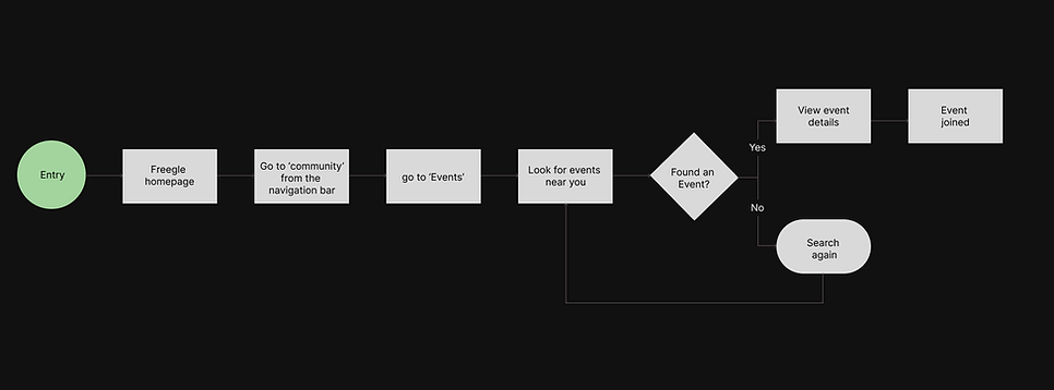
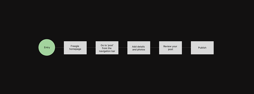
To effectively plan the redesign, I constructed a user flow diagram, dedicated to solving the navigation issue faced by the users.

Task 1 - Search for Desk via navigating through the app.
Task 2 - Join a charity event taking place in your area.
Task 3 - Post for a bedside lamp.
The
Approach
Ideation
To gain a better understanding of content and information layout on different screens, I began by sketching out initial ideas to assess the overall composition and refine my design direction.

Putting function before form.
I developed a collection of low-fidelity wireframes, to focus on functionality before integrating visual design work and to have a better understanding of the layout and design.
Wireframe

Logo

Rebranding
Reimagining Freegle
Based on user feedback from formative testing, the rebranding of Freegle was carried out to enhance its visual aesthetics of the app.
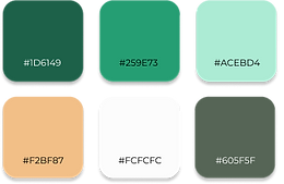
Color
The colors of the app has been simplified from the original palette, which featured mainly green tones. The new colour scheme aimed to add contrasting hues that would enhance the current greens. The goal was to increase visual interest.
Freegle's newly created logo emphasises the promotion of reuse while maintaining the fundamental elements of its prior brand. By using leaves in the design, the logo encourages users to embrace eco-friendly habits, promoting a more environmentally responsible approach through the use of Freegle.
Pattern
The Freegle logo has been expertly incorporated into a pattern that is continuously used on different app displays. This purposeful design choice seeks to establish a unified visual identity and enhance the app's brand recognition.
Final Design
Final prototype
I specifically targeted the four pain points uncovered through usability testing. I carefully considered the features and functionalities of other market-competing apps, such as Olio, Craigslist, and Freecycle while redesigning Freegle. By using a systematic strategy, the Freegle app is kept up to date with consumer demands and market developments.
View Figma prototype

Removing visual clutter
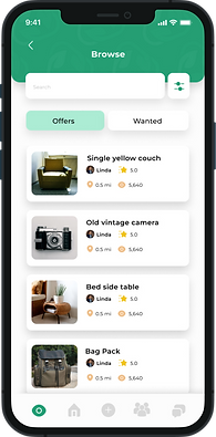
The new Rebranding has been incorporated in the app. To successfully convey the goal and aim of Freegle, a banner is introduced. In order to improve app usability and provide quicker access to pertinent things, categories sections have been added on the home page. Both offers and demands are included in the Browse area, a wider spectrum of user needs is being served.
Problem focus
Improving Navigation
The hamburger menu options were consolidated, and card sorting methods were used to produce a user-centric interface that was focused on homes. A bottom navigation bar makes it simpler to reach important elements like community and events page.
Problem focus
System Architecture
User authentication has been added to make Freegle a safe place. For easier browsing and a better user experience, items are now categorised.
Users can sort listings by newest, nearest, categories, and communities using filters.
Problem focus


Understanding user perspective
Formative testing
Summative testing was done after the prototyping phase of the app to determine the degree of progress made. The same surveys were used to collect insightful user input in order to guarantee a thorough examination.(n = 5)
1
Tasks and Severity Survey
Same three tasks as formative testing were given for summative testing to the same set of users. They managed to accomplish the tasks error-free.
2
System Usability Scale
The redesigned version of the Freegle app received high ratings for its performance, clarity, and ease of navigation and received a score of 97%.
3
Product Reaction Cards
. Participants were again asked to pick five words and further explain them after selecting all pertinent words. 92% of the Users gave positive responses for the redesigned version.
What
did I learn
Reflection
My main goal was to keep the Freegle app's essential essence while polishing and streamlining the visual design. In developing a design strategy, I prioritised attainable enhancements while considering the practical implications of execution. This process ensured that my design choices not only improved the user experience but also corresponded with the company's operational reality.